The Fraudsters Usurping Technical Analysis
Technical analysis gets a lot of slack and some of this slack is understandable. There are a ton of snake oil salesmen and scammers portraying “their version” of technical analysis to be some sort of financial holy grail that makes trading easy. For example, you’ll see a claim such as this being made a lot:
“Buy my $3,000 trading course where I’ll show you my x proprietary trading strategy based on x technical indicator and make triple digit returns!”
We all know this is nonsense, but unfortunately many people, especially teenagers and young adults, are falling prey to this kind of garbage. Why is this so? Well, for one, as I stated earlier, these “magic indicators” make trading and investing look easier than it actually is. “So you’re saying I just follow this guy or girl and use this indicator and I don’t have to put any work and make tens to hundreds of thousands?” Again, anyone who comes across this stuff should be smart enough to know these are scams, but when we’re young we fall prey to these kind of things because we’re not yet fully matured.
These “magic indicators” are marketed by these fraudsters in ways that look super cool, and everybody loves cool, especially young folk. They’ll have a chart up of SPY and have 50 different indicators with all these super cool color schemes, crazy drawings that look like pictures of the moon, or some other symbol, all of which are supposed to tell you what the next price will be. It’s all nonsense, so I get why some people would feel this way about technical analysis when they see scammers using it to take advantage of people. This is the reason why professional money managers don’t really talk about technical analysis, even though they all use some variety of technical analysis when constructing portfolios and allocating assets. These scammers are not professionals, they don’t trade for a living. They are making a living selling their garbage to vulnerable people, which is reprehensible.
The truth of the matter is, although there are tons of scammers selling trading courses promising you the ability to go to Mars and back, there are also plenty of trading vendors out there that include as part of their services learning their methodology, which indicators to use, etc. The difference with the latter vendors is that they a) have a proven track record, b) provide high quality education, c) don’t market their courses in such ridiculous, bombastic and fraudulent ways, d) don’t promise you the moon, and very likely e) don’t charge you nearly as much. Just like all things in life, it requires work to research and find such vendors and expend your capital in ways that suit your budget and needs.
There is nothing wrong with selling education so long as you’re not lying and offer services of true value. Unfortunately though, the honest and legitimate vendors are outnumbered by the scams and frauds.
By the way, you don’t need to spend such obscene amounts of money to learn things that can be learned from less expensive, dense, and resource rich books, as well as a plethora of free resources out there. In my opinion, the true value that courses add is the consolidation of applicable theory and knowledge. Basically, the ability to focus your attention on the important stuff. While this is great, you don’t need to and should not shell out thousands for this.
What Technical Analysis Is, Why It’s Useful, and Why I Think Those Against It Are Wrong
Now to the crux of the post. The technical analysis that is marketed to you by frauds and scammers is not real technical analysis. Real technical analysis has true value and is a great tool to use for trading and investing. The issue I have with those who believe technical analysis is nonsense is that they either a) have a view of technical analysis influenced by the scams, or b) have right and wrong interpretations of technical analysis with conclusions I disagree with. For further simplicity, let’s label them Group A and Group B. With Group A, it’s self explanatory. They believe technical analysis is the analysis marketed by the wannabe gurus and scammers, which it is not. Let’s clear out the air. No indicator is going to tell you what the next price will be. No one knows what the next price or following prices will be. These indicators are simply using past price and volume data and just displaying that data to you in a different way. That is the value they bring—a less-detailed yet simple way of showing you past data. They do not lead and simply cannot let you in on the next price. The same goes for the magic drawings and symbols, which are voodoo silliness.
It’s crucial to understand what technical analysis is and claims to do to gain a better understanding of it and its elements. In short, technical analysis is the analysis of past price, volume, and open interest (futures and options) data on a chart for the purpose of forecasting future price action. Technical analysis does not claim to be a magic-like tool that “lets you in on future price,” but it offers you insights into trends, relationships between securities, patterns and recurring price behaviors, etc., that can give you an idea, a thesis, as to where price might go and how to react when it does or does not move in the way you thought. This is highly, highly useful as you will come to see shortly.
With Group B, I think they have a general understanding of technical analysis that is sound, but there are some elements of their interpretation that I disagree with. Firstly, patterns in price. Yes human beings can make anything out to be a pattern and often search for anything to confirm their priors. Yes, patterns are often subjective. Yes, price is mostly random. These things are all true. Group B would therefore say: “TA (technical analysis) cannot give you a sound idea of where price is likely to go and therefore does not give you a repeatable edge in the markets.” Well, quite frankly, I believe this to be wrong and incomplete. Just because markets today are highly competitive, accessible to more people than ever before, and trade mostly random does not mean that patterns in price do not exist, cannot give you a thesis as to where price is headed, and cannot be repeatedly traded profitably. Patterns in price do exist. Take a look at this 1900s Dow chart below, posted by Mark Minervini on Twitter, a renowned stock trader featured in Jack Schwager’s Market Wizards. Mark won the US Investing Championship in 1997 and again in 2021. For those of you who have never heard of the US Investing Championship, it’s a professional and audited trading tournament where traders from around the world compete to achieve the highest percentage return in 1 years’ time. Mark’s success in investing and trading is a testament to the timeliness of his approach, which has a great deal to do with price patterns.
What’s taking place in the chart below is a prior uptrend and then a consolidation basing phase, where price becomes rangebound. In this consolidation phase, we see three periods where prices get tight, but notice how they get tighter and tighter with each new period. We’re seeing a contraction of volatility. Moves are becoming less and less pronounced. Throughout this period, supply and demand are in relative equilibrium, and we don’t see large swings up or down, which occur when there are more material supply-demand imbalances. But then suddenly, around June 1904 or thereabouts, we see a breakout of consolidation on greater than average volume. This indicates a shift. It shows us that there was enough volume of buys to breakout of the resistance of what has been a long period of consolidation, giving us a clue that maybe demand is starting to overrun supply. Sure enough, we saw what happened later on. Demand became stronger than supply and the index moved up from about 50 to 69 in 25 weeks.

Group B and maybe you might be thinking, “how does one chart of the Dow back in 1903 show me pattern repeatability and the ability to profit consistently over time?” “Not every chart is going to trade just like this example, many will fail.” “Again, technical analysis cannot give you clues to future price and cannot be relied upon to profit in markets.”
One chart from way back then for sure does not show a repeatable edge, but there a countless examples of this same pattern occurring over and over again in different equities throughout time. A period of accumulation, followed by consolidation, then a breakout of consolidation on large volume, followed by large price appreciation (new phase of accumulation). Check out some other examples of this trading pattern occurring in different periods of history below.


Maybe some portion of those in Group B believe in the efficient market hypothesis, which stipulates, among many other things, that price is not “a little random,” but totally random. The charts above speak for themselves. The examples I’ve given you above do not showcase random price behavior. There’s always a little “noise,” but the fundamental recurring behavior simply can’t be random if it occurs with such high frequency among all stocks for hundreds of years.
I’ve assumed that some in Group B believe in efficient market theory, but maybe most in Group B don’t. For the majority, I can sense thinking along the lines of this right now: “Again, how do several charts show me a lasting edge?” “There probably aren’t many of these formations and even if there are, probably most don’t end up working and fall to the downside.” I can assure the latter sect of Group B that there are a plethora of examples of this basic formation occurring in the market throughout history. Don’t believe me? Check out “How To Make Money In Stocks” by William J. O’Neil and you’ll see hundreds of charts with the same basic pattern. The 1st and 4th charts above are also laid out in Bill’s book in greater detail. Opportunities in the market such as those above are made easier to capture and capitalize on with the use of technical analysis and charts.
It’s important to make clear that the edge is not in the charts in and of themselves but in the patterns in price. However, since you cannot find, examine, and exploit such price patterns without charts (it would be really hard to do so without them), it means that this kind of market edge and charting are inextricably linked. Technical analysis can therefore absolutely help you generate a thesis on future price movement (with some caveats; more on this later).
To the second point on failed breakouts, yes, often times these breakouts do end up failing, but with proper risk management, you can cut your losses short and allocate capital into opportunities that do end up working, giving you a positive expectancy and overall profitability. This takes a long time to develop as a skill. That brings me to another reason why I think Group B is misguided. I think they’re not taking into account just how big of a role risk management plays alongside the use of technical analysis, which gives one the ability to capitalize on the proliferation of these patterns in a long-term and sustainable way. With proper risk management and stop-loss levels, the use of technical analysis can give you that long-term positive expectancy. Technical analysis greatly assists risk management too! It would be harder to figure out appropriate stop-loss or profit-taking levels without looking at a price chart and evaluating recent support or resistance, for example.
It takes continued work and experience to use technical analysis or any other form of analysis effectively. It may be that those in Group B simply do not and will never believe in technical analysis, have used it no avail, or that it just doesn’t suit their investing style or personality. All of this is fine, but it shouldn’t be projected onto others that technical analysis “doesn’t work” because you don’t believe in it, or it hasn’t worked for you. Legendary traders in the past and present, from Jesse Livermore and Nicholas Darvas to Mark Minervini and David Ryan, and many others, have all profited massively on these same basic technical concepts, modified to their personal preferences.
What Empirical Evidence Has To Say About Technical Analysis
Group B may reply with: “It’s not just us, look at the empirical evidence of technical trading strategies.” “They don’t work and are unprofitable.” To this I reply, looking into the empirical evidence of technical trading strategies can often be a futile activity because there are many individuals that tailor their trading methods in specific ways that are difficult to test, and often go untested in these studies. For example, indicator combinations and the timing of order placements, certain stop-loss or profit-taking levels, pyramiding, patterns used to take advantage of and their variations, etc. It is often how a technical trading strategy is used that will define its success. Each of us are unique, we’re individuals after all, so we will modify aspects of our trading strategy to our liking. It is especially hard to test for chart patterns as they are quite subjective, and automated pattern recognition systems are still difficult to develop and therefore may not perform as well as intended. This is the reason most of the technical trading strategies tested are based on parameters that are more mathematical in nature, and can therefore be evaluated with greater accuracy which means the results are more reliable. However, many traders don’t trade solely off of these signals and include other technical and even fundamental characteristics as part of their strategy, which is again difficult to test for. With all this being said, just because something is difficult to test and evaluate doesn’t mean it isn’t totally worthwhile.
In a 2008 study conducted on the London Stock Exchange FT30 Index, using the RSI (Relative Strength Index) and MACD (Moving Average Convergence Divergence) as oscillators showed that over a 60-year period, RSI and MACD rules beat a buy-and-hold approach in most cases. Another parameter based study focused on comparing a double moving-average crossover strategy using the 18-day and 183-day moving averages of the SPDR SPY ETF which tracks the S&P 500 Index, to buying and holding the same index. Through testing of daily data from the beginning of 2009 to the latter end of 2014, the study found that the moving average strategy had lower returns, but on lower risk versus the buy-and-hold approach. The buy-and-hold approach had an annualized return of 30 percent during the period with a risk of 21 percent, while the moving average strategy had a total return of 24 percent with a risk of 14 percent. The Sharpe ratios were 1.214 versus 1.351, respectively.
One could suggest from these results that buy-and-hold is superior to a market timing approach using moving averages, but the study did not conduct testing with the moving average strategy during a longer-term period where there were market corrections, including the financial crisis of 2008-09, as well as the early 2000’s market correction. In these corrections, the risk of holding is substantial and returns are negative. While it is likely that buying and holding the overall market through the SPY ETF would still generate higher absolute returns versus the moving-average crossover strategy (as laid out in the study) on the same security over the full period, it is unclear what the risk comparisons would be on the whole. Also, the psychological pressures during corrective periods will test one’s ability to stay in the market. Extrapolating the results from the 2009-2014 period, one could make the case that a dual moving-average crossover approach would reduce the likelihood of tail-risk losses, making this a decent strategy for those with low risk appetites.
It’s also important to note that all orders occurred at market prices and no limit or stop-loss orders were allowed. One could see how the use of limit and stop-loss orders could alter the results of the study. The study was conducted on an ETF tracking the overall market and not any individual stocks, and it did not factor EMAs (exponential moving averages) into crossover testing. Also, the study wasn’t a long-only approach. When the 18-day SMA crossed below the 183-day SMA, any previous long position was exited and a short position was initiated.
A 2008 technical trading study by Camillo Lento was conducted on daily S&P 500 data from January 1950 to March 2008, a 59-year period. Three individual technical trading strategies based on three rules with different variants, as well as a combined signal approach using a combination of signals from each strategy, were studied to determine whether or not excess returns could be achieved net of transaction costs versus buying and holding the S&P 500. The first trading rule strategy was a moving-average crossover. The combinations tested were the (1, 50), (1, 200), and (5, 150) day variable-length moving averages. The second trading rule strategy used percentage filters of 1, 2, and 5 percent above or below a recent trough or peak to generate buy and sell signals. The third trading rule strategy was based on a trading-range breakout above or below recent resistance or support based on 50, 100, and 200-day price action.
Profitability was determined by comparing the returns generated by the three trading rule strategies to the buy-and-hold returns (given the parameters of each strategy). Across the three rule strategies, the moving-average crossover was the only set of rules to generate excess returns after adjusting for transaction costs. The only moving-average combinations to do so were the (1, 200) and (5, 150) combinations. The 1-percent filter rule outperformed the market by 5.2%, but excess gains disappeared after accounting for transaction costs. None of the trading-range breakout rules were able to beat the market, but the 200-day trading-range breakout rule performed the best out of all combinations.
As far as predictive ability is concerned, buy signals were more correct than sell signals, and all of the buy signals generated by the moving-average crossover and trading-range breakout rules were significant.
Despite the excess returns generated by the moving-average crossover rules, returns were still reduced significantly by transaction costs. When looking into sub-period analysis of the results, none of the nine total trading rules generated positive returns in all three sub-periods. The three sub-periods evaluated were determined by arbitrarily dividing the data sets into thirds and using the Chow Test to test for structural breaks between the subsets. The most robust returns were generated by the moving-average crossover rules. Eight of the nine rules were unable to beat buy-and-hold in the last sub-period (1990-2008), the worst performance among the three sub-periods. Return and risk ratios were also inconsistent with each period, suggesting that returns generated by profitable technical rules did not come without a great deal of risk.
One might look at these results and think parameter-based technical strategies are simply not worthwhile. But the results alter pretty drastically when combining signals among all nine rules across each of the three strategies. The theory behind a CSA (combined signal approach) is that information related to future price movements is often dispersed and potentially combining multiple trading signals may generate a more informative signal overall. It is also assumed that synthesizing these signals and placing positions with consensus reduces the risk of relying on a single rule at any given time.
When making use of all nine trading signals, a combined signal is obtained through a certain decision protocol: A long/short position is entered if “x” or more of the nine trading signals suggest a long/short position. The study tested CSA combinations of (2/9), (3/9), (4/9), (5/9), and (6/9) trading signals. The results of this test revealed that all CSA variants beat the market before adjusting for transaction costs, and the (2/9) and (4/9) CSA variants were able to outperform the market after adjusting for transaction costs. The (3/9) CSA generated the same return as the market. Compared to the weak to unprofitable standalone individual trading rules, the CSA consistently outperformed the S&P 500 over the full period. The sub-period analysis revealed that the (2/9) CSA earned excess returns in all three sub-periods with a stable Sharpe ratio. These are impressive results. One can see excess returns improving through the addition of risk management techniques such as placing stop-loss orders, using a long-only approach, and incorporating other factors such as chart patterns and volume.
This work by Lento builds on a previous study by Lento and Gradojevic from the year prior (2007), which tested the profitability of trading rules and a combined signal approach on the Dow Jones Industrial Average, S&P/TSX 300, and NASDAQ Composite indices as well as the Canada/US spot exchange rate from 1995 to 2004. The trading rules tested were moving-average crossovers, trading-range breakouts, filters, and bollinger bands (the first three rules use the same combinations as the Lento (2008) study).
Before using a combined signal approach, it was found that the trading rules performed best in the foreign exchange market (10 out of the total 12 rules generated excess returns after adjusting for transaction costs compared to a buy-and-hold approach). Each of the moving-average crossover and trading-range breakout rules outperformed the buy-and-hold strategy on the NASDAQ generating excess returns from 8.7% to 14.4%, after transaction costs. The 1 and 2-percent filter rules generated excess returns but after adjusting for transaction costs, negative excess returns were created. The large number of trades and subsequent transaction costs eroded profitability. The moving-average crossover and trading-range breakout rules were found to beat buy-and-hold on the TSX index, however the excess returns generated were smaller compared to the NASDAQ, from 0.1 to 5.5%. No set of technical trading rules performed better than buy-and-hold on the DJIA. Bollinger bands did not perform well for all indices, however two of the three bollinger band rules performed better than buying-and-holding the Canadian/US spot rate (20 MA +/- 2 SD and 30 MA +/- 2 SD).
In terms of sub-period analysis, only 4 out of the total 48 trading rules tested generated positive excess returns in all three sub-periods, and Sharpe Ratios were inconsistent, revealing that excess returns did not come without high risk. The three sub-periods evaluated were: 1) Pre-Bubble: May 1995 – Dec 1998, 2) Bubble: Jan 1999 – Dec 2001, and 3) Post-Bubble: Jan 2002 – Dec 2004.
Buy signals were more correct than sell signals, and 54.8% of the signals generated from the moving-average crossover, trading-range breakout, and filter rules were correct more than 50 percent of the time. All of the buy signals generated by the trading-range breakout rules on the Canadian TSX were significant. The sign prediction results from this study are similar to that from the Lento (2008) study.
The results described so far are solely the performance of the individual trading rules, but excess returns improve when using a combined signal approach. The decision protocol for a combined signal approach was that a long/short position would be taken if 7 or more of the 12 total trading rules suggested a long/short position. The results from a combined signal approach are again, in contrast to using only a set of individual trading rules. Nearly every return is in excess of the buy-and-hold strategy after applying a combined 7/12 signal and accounting for transaction costs. The only negative return is from the DJIA, and this is when bollinger bands are excluded. It’s amazing to see how combining signals created excess returns on the DJIA, when standalone individual trading rules did not.
These results are similar to the Lento (2008) study, but the Lento (2008) study is even more robust because it was performed on a highly liquid and followed instrument (S&P 500) and the period evaluated was 59 years rather than the 10-year period evaluated in the Lento, Gradojevic (2007) study. Due to the fact that only 10 years were evaluated in the 2007 study and those 10 years included periods of heightened volatility with the dot-com bubble, 9/11, and the geopolitical environment, one could say the results from this study are positively biased. But this is not the case with the 2008 study because of the longer duration evaluated. The 2008 study found that the CSA consistently outperformed the S&P 500 over the full 59-year period and excess returns were generated among all three sub-periods with a stable Sharpe ratio.
A 1995 study evaluated the predictive power and profitability of using the head-and-shoulders chart pattern in the foreign exchange market (six currency daily spot rates versus the US dollar (German mark, Japanese yen, Canadian dollar, Swiss franc, French franc, and pound)). The period tested was from March 1973 to June 1994. A computerized identification algorithm was created to identify head-and-shoulders patterns in the data as well as a real-time strategy for entering and exiting. Both head-and-shoulders tops and head-and-shoulders bottoms (inverted head-and-shoulders) patterns were tested, therefore both short and long entries were taken.
Entries were taken at the closing price of the day of the neckline penetration (not the price immediately after penetration (intraday prices were not observed)). Exits were analyzed endogenously and exogenously. Endogenous exits were made after prices stopped moving in the predicted direction following the entry. For example, for a head-and-shoulders top, short positions were exited as soon as a new trough was identified, i.e. when price has risen the cutoff percent above that bottom. The cutoff percentages used were 0, 1, 3, and 5 percent. Two caveats were applied to the endogenous exit rule. A stop-loss was placed at 1 percent of the original price at entry, and to prevent premature exits from bounces/tests after neckline penetrations, a 25 percent bounce parameter was included (25 percent of the distance from the head to the neckline). Bounce possibilities were invoked 15 percent of the time for most currencies. For exogenous exits, positions were simply exited after a specified number of days (1, 3 ,5, 10, 20, 30, and 60 days).
The results revealed that from 1973 to 1994 significant (in terms of magnitude and statistics) returns were generated for both the German mark and the Japanese yen, but not for the other currencies. For the mark, thirty-two speculative positions were taken with an average holding period of seventeen business days. For the yen, twenty speculative positions were taken with an average holding period of twenty-two business days. On any given position, returns averaged 0.78% and 1.52% for the mark and yen respectively, with returns reaching as high as 9.0% for the mark, and 12.8% for yen, per position held. Average profits for the French franc though statistically insignificant, were greater than 0.50% on an average holding period of slightly longer than three weeks. The remaining currencies had negative average profits. Note that all of these figures are from the endogenous exit rules, as the exogenous exit rules, for the most part, did not generate meaningful returns for all of the currencies.
Using average returns and extrapolating them out to a full year, the mark yielded an annual 13 percent return, while the yen yielded an annual 19 percent return. This is impressive as these returns exceeded bond yields, average stock market yields and average buy-and-hold yields for each respective currency over the full duration. The average annual buy-and-hold yields for the mark and yen were 2.48% and 4.35%, over the 21-year period. Profits from the mark and yen were significant even after adjusting for interest rate differentials and transaction costs. After adjusting for both of these factors, average returns per position were actually higher for the mark at 0.86% and slightly lower for the yen at 1.48%. Though the results for the mark and yen are indeed impressive, the overall results are mixed since four out of the six currencies tested did not generate meaningful profits. C.L. Osler and P.H. Kevin Chang, the authors of the study, therefore decided to test for profits from investing in all six currencies simultaneously during the full period. They found that aggregate profits would’ve been statistically and economically meaningful, generating a total return over the full period of 69.9%.
A 2000 study by Lo, Mamayski, and Wang tested the utility of ten chart patterns and performed goodness-of-fit tests to confirm whether the technical patterns were informative. Through use of the kernel regression (a smoothing oscillator) in the recognition system for patterns, they found that most patterns provided informative value. Tests were conducted on the daily returns of individual NYSE/AMEX and NASDAQ stocks from 1962 to 1999. NYSE/AMEX stocks showed significance for seven of the ten patterns, while all patterns were significant for the NASDAQ stocks. However, the study found little significance when conditioning for increasing or decreasing volume for most patterns among both sets of stocks. As an extension to this study, James Steeley and Edward Dawson performed a similar test on UK stocks. They found that on UK data, technical patterns occur in different frequencies to each other and in different relativities to the frequencies found in the US market. Such patterns on the UK market were found to be less influential, and each pattern resulted in negative returns across all periods evaluated.
A 2003 study by Savin, Weller, and Zvingelis used a modified version of Lo, Mamayski, and Wang’s pattern recognition algorithm by including filters based on technician Thomas Bulkowski’s research to test the predictive power and profitability of the head-and-shoulders top pattern over periods of one, two, and three months rather than one day on the S&P 500 and Russell 2000 stocks. The period of data tested was from 1990 to 1999. The reason for the change in time evaluation for the pattern is because the head-and-shoulders pattern typically occurs within a three month window. Additional restrictions on extrema were made to satisfy technicians’ views on the pattern. Continuous compound returns were calculated over 20, 40, and 60 trading days rather than the 1 day calculation in the Lo et al. study. Risk-adjusted excess returns conditioned on use of the head-and-shoulders pattern were 7 to 9 percent, without accounting for transaction costs. These are pretty remarkable results, but it’s unclear what the net total return would be after adjusting for transaction costs, and the head-and-shoulders bottom pattern was not evaluated. Strong evidence was found that for both sets of stocks (S&P 500 and Russell 2000) the head-and-shoulders top pattern predicts a decline in price.
A more recent 2014 study by Terence Tai-Leung Chong and Ka-Ho Poon, extended on the Savin et al. study by factoring in the overall trend the head-and-shoulders pattern was in via use of a filter (150 and 200-day SMA’s) to remove invalid patterns. The head-and-shoulders bottom pattern was also evaluated. In order for the patterns to be valid, three extrema had to be above or below the simple moving averages. Risk-adjusted excess returns were reported by combining the use of both patterns, but because this might cause confusion and misleading results, a more restrictive filter was introduced requiring the first five extrema to be on one side of the SMA, reducing the likelihood of capturing a wrong pattern. The data and period evaluated were the same as those in the Savin et al. study. 20 and 60-day exits were used to calculate excess returns and transaction costs were assumed to be negligible. Both sets of trend reversal patterns were found to have negative excess returns even with moving average filters, but returns improved when using a moving average filter. Surprisingly, when treating the head-and-shoulders bottom pattern as a continuation (they tested for going short rather long after the pattern completed), risk-adjusted excess returns were positive and significant. It’s strange that they assumed a head-and-shoulders bottom continuation to mean going short rather than long, since that is counter to technical guidelines, and even more strange that it generated positive excess returns. It would’ve been nice to see the returns generated by treating a head-and-shoulders bottom continuation as a continuation of a prior uptrend, therefore going long rather than short.
Gunduz Caginalp and Henry Laurent tested the predictive power and profitability of candlestick patterns (open, high, low, close) on all S&P 500 stocks from 1992 to 1996. Results revealed that the patterns had substantial short-term predictive power. In particular, the three white soldiers (TWS) and three inside up (TIU) patterns were found to be predictive about three-fourths of the time for most of the entire data sets. Profits were calculated by purchasing stock near the close and selling or buying to close one-third of the purchased stock on each of the following three days. For all four down-to-up reversal patterns, the average rate of return was found to be 0.9%, resulting in a significant annual compounded return of 309%. For the up-to-down reversal patterns the average rate of return was 0.27%, giving an annual compounded return of 140%. After accounting for the bid-ask spread and trade commissions, buy-side returns were still substantial at between 0.56 and 0.76% on a $100,000 trade, compounded into a 202 to 259% annual return on initial investment. These are very significant results. Other studies have also corroborated the predictability and profitability of candlestick patterns in the stock and forex markets.
As you can see, when looking at the empirical evidence of technical analysis, the results are mixed. I commend those in academia for producing such research, as it is very informative and can help us make better investment decisions. Plus, it is highly interesting and engaging. Ultimately, technical analysis is one of those subjects that causes a lot of debate and uproar and tends to divide people into two firm camps. I am admittedly biased about the usefulness of technical analysis in helping you profit in the markets, but do encourage those who believe technical analysis is a bunch of gobbledygook to have an open mind, study, and use technical concepts. Applying technical concepts will certainly change your mind about technical analysis if you find it helps you profit in the markets. And just like anything, successful application is a journey and takes time.
You may wonder why I said I’m biased about the efficacy of technical analysis, but there are reasons why, and the reasons are not just the positive studies. Quite frankly, the studies are last reason why I am pro-technical analysis. The main reasons why I believe in technical analysis are a) the fundamental concepts underlying it make logical sense and can be seen on numerous charts (more on this later), and b) there are countless examples throughout history and in the modern day of real people, real individual traders, profiting consistently and substantially by using technical concepts. If a tool truly did not work or help in any way, then no one using that tool would have any success. But this just isn’t the case with technical analysis. In all honesty, I think part of the reason some of the studies show mixed to poor results is because technical strategies are individual, and it’s really difficult to test and extrapolate definitive results from something that can be so personalized.
Also, the chart patterns do not formulate themselves in the same way each time, there are slight tweaks and variations that still today only humans can comprehend and act more reliably in real-time. From the basic interpretation of most of the patterns evaluated in these studies, we do see evidence of usefulness and predictive ability. One can see how with the advantage humans still have in pattern recognition, the patterns combined with other technical characteristics would yield risk-adjusted excess returns even after transaction costs. Also, risk management is absolutely crucial and, again, personal. Stop-loss decision making was not much of a theme in many of these studies as well. It’s important to understand that risk management is variable, it’s not some parameter that is constant for every trade, it changes depending on the characteristics of the price action, location of price within ranges, moving averages, etc. Again, this is something humans still have an advantage in compared to computers, even today. A 2009 study found strong indications of stop-loss strategies being able to beat a buy-and-hold portfolio approach in both expected and risk-adjusted expected returns in the Swedish market.
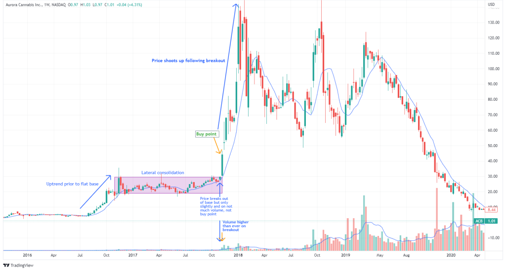
It’s also critical to understand that not all chart patterns are created equal. What I mean by this, is that not all chart patterns have the same success and failure rates, and the success rates are often dependent on the market environment (uptrend, sideways, downtrend, i.e. bull, ranging, or bear market). Thomas Bulkowski, as mentioned earlier, is an experienced market technician who has conducted research on the performance of various chart patterns. He ranks the cup with handle and rectangle top (lateral consolidation) patterns at 3 and 4 (lower is better) in terms of performance of bull market, upward breakout patterns. The failure rank for a cup with handle is 2 (lower is better), which is only bested by the rounding bottom at 1. (By the way, the cup with handle is a variation of the rounding bottom). The rounding bottom was ranked 7 in terms of performance. The failure rank for a rectangle top was 23. These ranks are out of a sample size of 39 bull market, upward breakout patterns. Check out the full rankings here. While this is research and findings from one source (Bulkowski), it still gives us a decent idea of the success and failure rates of different patterns and how they differ for each pattern. This helps technical traders by allowing them to incorporate the use of patterns that perform well during market environments where their particular strategy performs well.
As I stated earlier, the best evidence for technical analysis’s effectiveness are the numerous traders who have amassed fortunes using it. But it’s not just the traders per se. It’s the strategies they are implementing. Most people don’t usually come up with brand new strategies; typically, they use and build upon predecessors who have either disruptively created a strong strategy or have also built upon the heirs of a strategy. While the differentiation in returns among traders is a great deal due to skill level and execution, strategies that are being used are a huge part of the equation. You might be an amazing trader, but if you’re implementing a bad strategy, one that consistently underperforms or at best equals the market, then that is what is ultimately stopping you from profiting in the market.
The CANSLIM investing strategy is a growth stock investing strategy that incorporates both fundamental and technical analysis. It was developed in the 1950s by William O’Neil, the author of “How To Make Money In Stocks,” whom I mentioned earlier in this article. AAII (American Association of Individual Investors) is a non-profit organization whose goal it is to educate about investing and financial planning. They create model screens and portfolios based on criteria from a variety of strategies from well-known investors and rank their performance. AAII’s CANSLIM screen incorporating CANSLIM characteristics is the third-best ranked strategy in terms of performance since inception out of a total of 42 investing strategies, with an inception annual price gain of 18.8%. Since 1998, the strategy has returned a compound growth rate of 7,359.8% compared to the S&P 500’s gain of 299.5% from the same period (1998-2022). An AAII study on the performance of 50 investment strategies from 1998-2009 found that CANSLIM was the best performing strategy generating a compound growth rate of 2,763%, an average of 35.3% a year, compared to the S&P 500’s compound growth rate of 14.9%, an average of 3.3% per year over the same period.
CANSLIM bases a large part of its methodology on the “same basic pattern” I kept harping on about earlier. CANSLIM attempts to capitalize on the recurring accumulation -> distribution -> consolidation -> accumulation cycle by paying attention to trends, emerging patterns such as the cup with handle, flat base, etc., and other factors to correctly time buys as stocks start making their huge gains. In fact, this is not groundbreaking. What O’Neil did was brilliant in that he took the work of legendary traders such as Richard Wyckoff, Jesse Livermore, Gerald Loeb, Nicholas Darvas, etc., and built upon their findings and teachings by adding more input on stock fundamentals and fundamental filters for investing and trading. This is indeed brilliant, as it takes advantage of seeming momentum patterns in the market while also utilizing technical analysis to correctly time buys and limit or expand exposure depending on the prevailing market trend and price action. This allows one to take advantage of the positive fundamental drivers of certain stocks, capturing the big moves while reducing risk and obtaining better entries through the use of charts. Incorporating fundamental analysis along with technical analysis has been shown to improve the performance of a strictly technical, momentum approach. Further evidence of the success of CANSLIM is corroborated by studies by Lutey et al. showing that a much more simplified CANSLIM approach produced significant excess returns on lower risk against the S&P 500 and NASDAQ 100 and achieved superior returns per unit of risk when compared to the DJIA.
Ultimately, each flavor of this momentum-growth style of trading derives from one core strategy: trend-following. The legendary traders I have listed above are each riding trends and paying close attention to the market to correct course when trends waver and new trends emerge. Trend-following has a centuries-long history of producing stable excess returns across markets and asset classes, including stocks.
So case and point, depending on what you read and who you listen to, technical analysis is either useless and ineffective or extremely useful and informative. By now you know which camp I am in, but to re-iterate, the best evidence is that real traders and their technically-focused strategies have consistently outperformed the broader market. Also, technical analysis does have some empirical backing in terms of predictive ability and outperforming the broader market, as laid out above.
When the use of a specific tool takes up such a large part of a process that ultimately results in a successful outcome, it’s often that very tool that made all the difference. This should not be overlooked. The fact that trend, pattern, and volume analysis are each crucial parts to CANSLIM, in my opinion proves that these technical concepts are a huge reason why the strategy is so successful.
At the end of the day, what you believe in is what you believe in; it’s up to you to read and decide whether or not you agree that technical analysis is informative and can help you consistently profit in the markets. The best way to find this out is to study and apply technical concepts yourself, but you can’t do this if you harbor unwavering anti-technical views and are steadfastly against technical analysis. If you are indeed strongly against technical analysis, there’s absolutely nothing wrong with this. I just hope that I have found a way to thread the needle and, at the very least, make you question your anti-technical analysis views thus far. I encourage you to finish reading the remainder of this article to gain further clarity.
How Technical Analysis Shines, Its Core Tenants, and How Human Psychology Influences Markets
Technical analysis is not foolproof, it’s not a financial holy grail that gives you all of the answers, it’s a tool, and just like any tool it helps you in your critical thinking, decision-making, and takes time to learn. Yes, many of the examples you’ve seen earlier are often on the back of a bullish market and strong fundamentals, or at the very least a bullish turn in the market and stock fundamentals. Often, the occurrence of these two factors are of the utmost importance for a strong, consistent edge. Like all trading and investing strategies, they may work very well under certain conditions and poorly in others. One thing is for certain, it would be harder to ascertain this without using charts. Again, technical analysis by itself is just another tool, that can and should be accompanied by other tools such as fundamental and macroeconomic analysis.
The reason why technical analysis can be effective in predicting future price moves is because of the centuries long history of certain nonlinear formations being repeated, time and time again. Traders are not making predictions on future price in an errant, random, on the fly kind of manner. Traders anticipate breakouts and upward price moves following breakouts from these patterns because of the history of this price action occurring with great frequency. It would be very hard to capitalize and profit on such breakout opportunities without using technical analysis in studying patterns, support and resistance levels, current and past trends, etc. I’ve stated the word ‘predict’ a lot in this paragraph, but the better word to use is expect. Traders expect demand to surge following a breakout because of the great tendency of this happening in the past.
In any case, where chart use really shines is in its ability to allow one to react to new changes in price. We may predict or expect price to go up or down, or for example, a breakout to happen eventually, but we shall only act with real money when price changes have been materialized and there are confirmations. We only only act when the market has acted in tune with our expectation. So for example, if a breakout occurs and stays above resistance on strong volume near the close, we may look to buy. If after we buy price retests prior resistance (now new support) and breaks down by the close on strong volume, we may look to sell. In essence, technical analysis actualized this way is more reactive than predictive, and more effective. New price and volume data will quickly let us know if we were wrong or right in our prediction and allow us to either enter at a profit, cut our losses, hold, or add to our gains in a more successful way. The money made in trading is not merely from predicting correctly but from reacting when it is time to react, and there isn’t a better way to do this other than using technical analysis. In fact, you don’t even have to be right in your initial prediction! When the market, for example, moves in the opposite direction to your prediction, you can quickly place a trade in that direction for a profit.
A crucial theme to technical analysis is the idea that markets trend. In basic terms, there are three trends. An uptrend, where price makes higher highs and higher lows, a sideways trend with horizontal peaks and troughs, and a downtrend where there are lower highs and lower lows. Essentially, a trend is the general direction of price over time. Take a quick look at any chart of any asset and you will see a trend. It may be a long-term trend, an intermediate one, or a short-term one. You will likely see intermediate trends taking place within a longer-term trend, and shorter-term trends taking place within an intermediate trend. But what is absolutely clear is that you will see a trend. Why does price trade so often in trends? There are number of different factors that influence trends in price.
The market, while not a perfect discounting mechanism, is still highly efficient. Whatever information that’s available be it equity-specific, governmental, international, etc., has likely already been priced into the market, and any new information that is released is also quickly discounted. These constant information flows can quickly evoke new or continued sentiment, as market participants look to profit from how they believe current news, economic, and market events will impact markets in the future.
Macroeconomic changes can greatly impact economies and, therefore, financial market trends. Changes in interest rates affect the capital markets for companies, making it more expensive to borrow money to finance current or new initiatives and even keep distressed companies afloat. It also leads to expansions or contractions in the money supply, which help grow or reduce economic activity and business prospects. The interest rate increases in 2022, along with global supply-chain issues, made their way to equity prices accordingly.
Bottom-up stock fundamentals also have a substantial impact on trends. Companies that continue to report growing profits and sales will likely see their stock in an uptrend for some time. The opposite is true for companies that report ongoing decreases in earnings and revenue.
Another critical component to market trends is the psychology of market participants. The market may be a highly computerized beast today, but it is not an unemotional robot. It is made up of individual human beings trading all kinds of assets from stocks to bonds to commodities and derivatives, etc. Us humans are very emotional creatures and these emotions often drive our decision-making. Following the herd, fear, greed, and other emotions are all part of our psyche, and when you introduce money into the mix, it only exacerbates these feelings. The trading behaviors that take place as a result of these emotions can prolong trends.
You might be thinking: “This is supposed to be a post about the positives of technical analysis and you’re referencing fundamental and macroeconomic analysis?” “How does this support your argument that technical analysis is useful?” Well, each of these factors that influence the trend of the overall market, specific industry, or security can be seen and evaluated through the use of charts. These fundamental, behavioral, and macroeconomic influences are leading to changes in supply and demand and therefore changes in price for an asset. With technical analysis, you can see these changes being played out over time and put current and past changes into perspective. Sometimes, fundamental and macroeconomic factors can add additional noise to one’s analysis of the market, but with charts you can get a relatively decent picture of the current state of the market, or trend, based on the price and volume data. Price and volume data by the way, which already has the fundamentals factored in for the most part.
Another thing to keep in mind is that individual stocks frequently move for seemingly no reason at all, or for reasons that are unclear. However, with charts you can at least see these moves taking place. Meaning, you’re seeing markets move before the fundamental reasons why they’re moving are known and established. In a situation like this, market prices are leading the fundamentals! While all of the known fundamentals have already been priced in, the unknown fundamentals are just starting to be priced in, and this is what will be seen on the charts.
This is why many successful technical traders are known to say: “Don’t spend too much time attempting to find out the reason or reasons why a stock moved, because if you do, then any trading opportunity will have already left you.” This is me paraphrasing, but it nonetheless conveys the gist of the message, which is true! Ultimately, the reasons why the stock moved during that period will be revealed later on, when the opportunity to make money trading it is long gone. Now, this isn’t always the case. Often times, these stocks will setup again in the future, providing you another chance for a profitable trade. But it is unclear today if and when that future will take place, and if it is to take place, will it be under the right conditions?
Don’t take the message in the paragraph above the wrong way. Studying bottom-up stock fundamentals, industry health, and other factors is just as crucial as studying price action, as you want to be investing in healthy growth companies with big potential for massive price gains. Studying fundamental factors can also give you that additional perspective and clarity that is so desperately needed. However, keeping a close eye on the price action is essential to avoid missing out on opportunities. Even just a simple glance at a price and volume chart can give you a quick synopsis of a company’s success or trouble, which you can use to further investigate by diving deeper into the fundamentals.
Many wonder why exactly do the patterns in price elaborated earlier occur the way they do. There are many theories and explanations for the patterns such as the cup with handle, flat base, etc. In my opinion, they occur due to a variety of factors. One being, price discovery. If you noticed, the stocks of the charts I displayed above were all stocks of fairly new companies that had their initial public offerings just several years before. Cisco had its initial public offering in February of 1990, and notice how the buy points and breakouts all happened within the 1990s. Walmart went public in the early 1970s, and the breakout I showcased above was in early June 1980, not too long after its IPO. With new companies and stocks such as these, the price closest to the true fair value of the stock is constantly being reassessed from new information, including increases or decreases in earnings and sales.
The accumulation prior to consolidation often occurs because of earnings and sales growth or positive qualitative factors with regards to the company’s product/service offerings. The rounded base, flat base, i.e. general consolidation is where price in catching up to new information about the company, “takes a breather” before it makes its next move. The accumulation gets more pronounced following a breakout if the company continues to make positive fundamental gains, and sees greater long interest among institutional and retail investors.
Note that since these companies are relatively new, they are still quite unknown. Their stocks have little analyst coverage, lower volume and liquidity, which makes their trading behavior less random and therefore more predictive. Stock behavior that is more predictive provides a big edge to traders paying attention, and there’s no better way to be attune with this predictiveness than through the use of technical analysis. All of this is in contrast to mature blue-chip companies such as Apple or Google, which have huge name recognition, their products and services in nearly everyone’s hand, a large number of analysts covering their stocks which have high trading volume and liquidity, and everyone from institutional investors to retail investors trading them. With these stocks, the pricing looks more like a random-walk because they are so highly covered, known, and traded. Group B would therefore have a fair point in saying that technical analysis is less effective in anticipating future prices in well-known, highly liquid securities.
Another factor that I believe helps cause these patterns is again, the psychology of market participants and the effect they have on investor decision-making and ultimately price. The theme to note here is that human nature is an inherent part of the human experience. It’s literally in the term itself, “human” + “nature.” The continuous manifestation of the emotions associated with human nature leads to a repetition in corresponding behaviors. As Jesse Livermore stated so eloquently:
“I absolutely believe that price movement patterns are being repeated; they are recurring patterns that appear over and over, with slight variations. This is because stocks were being driven by humans-and human nature never changes.” – Jesse Livermore
Since different traders have different motivations and beliefs on a stock, the patterns will play out when certain trading groups become more dominant during specific periods. When this happens, you’ll often see some cross-herding in the same direction, i.e. if institutional investors are trading one way, then eventually individual investors will follow suit, and sometimes vice versa.
For example, in a cup with handle, accumulation occurs when smart money goes on a buying frenzy, creating the prior uptrend. Often retail investors see the stock being substantially accumulated and want to get in on the “next big investment craze” so they buy, but don’t realize they are buying at a time when demand is exhausted, and institutional investors are distributing i.e. selling off. Instead of cutting their losses short and selling as soon as price retreats downward, they convince themselves that the price is just fluctuating normally and will soon revert upward once again. A simple word for this is ‘hope.’ So, they hold their losing positions or may even add to them. This has the effect of keeping price from decreasing further than the bottom of the cup, but occurs with greater vigilance if institutional investors start accumulating at the bottom. For small to mid-cap stocks, institutions often split their orders at precise moments and engage in probe buying so as to remain liquid, considering the fact such stocks have lower volume and shares outstanding. The bottom of a cup is not only a sign of value on a fundamentally solid growth company, but also a good opportunity to enter based on market liquidity.
This institutional accumulation at the bottom causes prices to increase once more. A handle is formed when price gets to a level where investors who bought at the top of previous accumulation, can finally sell their positions at breakeven. However, this small imbalance in favor of supply doesn’t last very long as institutions continue to accumulate and long interest in the stock remains strong. Investors (both retail and institutions) who missed the last ride up in the stock’s price (accumulation prior to consolidation) and have seen prices rise for weeks, get involved and place buy orders, leading to a breakout on large volume. The breakout is typically accompanied by an even further surge in demand, where a prolonged phase of accumulation occurs and price increases significantly in a short time.
Notice how in a cup with handle, investors trading off of their emotions helped shape the trajectory of the pattern, including the rounding bottom and the handle.
There is some similarity in a flat base pattern, where institutional accumulation drives prices up, other investors accumulate at the top when institutions begin distributing, but the consolidation results in a trading range rather than a rounding bottom. Institutions again, do not mind entering or adding to positions at the support of the base, while other investors who bought at the top and are seeing sideways price action become less patient, so they sell at or near breakeven, in effect continuing the sideways price action. As this basing phase plays out, a breakout will occur when new investors place a greater volume of buy orders, which again often happens as a result of recent institutional accumulation and is typically accompanied by a new, larger phase of accumulation.
It’s important to understand that these chart patterns are not causing anything. They are simply the effect of the opinions, sentiments, and psychology of various market participants digesting recent and new information on the stock and trading it with their bias and or emotions. Technical analysis studies the effect, not the cause of market action. But again, since most information is already embedded within price itself, studying the “effect” for some people is often all that is needed to make money consistently in the markets.
I’ve laid out what I believe to be the psychological reasoning behind the occurrence of some chart patterns, which I think are logical. But, ultimately, it’s probably best to just note that they are a regular occurrence in the market because of repeated market dynamics, and emotionally-driven human behavior. I’ve explained what I believe to be the reasons behind the cup with handle and flat base patterns, but in all honesty, it would be foolish of me to state with certainty that the patterns occur because of the reasons I described above. While these reasons may in fact be true, they may not explain the patterns in every case, and there are other factors that may be known or unknown that influence the formation of the patterns too. Overall, trying to explain the reasons behind chart patterns, is like trying to explain traffic on a highway. This is best left to behavioral finance experts and psychologists. The good news is technical analysis is undoubtedly a great tool for students and intellectuals of behavioral finance and is really like an extension of the field.
There is one caveat that Group B and others believe with regard to charts causing market action and that is that during a breakout on large volume, many technical traders who see this believe it to be a bullish or bearish sign (depending on the pattern and overall trend), and place corresponding orders therefore causing bullish or bearish action to materialize. In other words, it’s a ‘self-fulfilling prophecy.’ There is some truth to this in my opinion.
In 2023, most people have access to the same price and volume data, and if enough market participants think and act on this data in the same way, then it will manifest itself in the price accordingly. This is especially the case if large swaths of people have been trained to view a certain price formation a specific way. So yes, I do think a self-fulfilling prophecy can come about from herd buying or selling via the use of technical analysis. However, long-lasting changes in the price of a security are not going to happen because of a self-fulfilling prophecy. The fundamentals of a company are ultimately what drive and cause sustained moves in the price of a stock. So, while certain technical signals, be they support and resistance or breakouts can lead to a self-fulfilling prophecy in the short-term, the fundamentals are what cause longer-term trends in a stock. The best of both words as a trader is to capture a breakout that may have a self-fulfilling element but is also supported by truly solid growth fundamentals.
To clarify a little more on breakouts, I sincerely believe the breakout is an organic feature that takes place after a pattern has completed. New long or short interest in a stock is what causes that move. It’s really the buying or selling add-on that can exacerbate the movement of a breakout, which I think can often be self-fulfilling.
I say all this, but there are counter-arguments to the notion of technical analysis being self-fulfilling, which are just as sensible as pro-self-fulfilling arguments.
While many technical traders can see the same patterns, breakouts, price support and resistance occurring, not every trader will have the same anticipation of future price from these movements. A trader may see a pattern breakout for example and think it’s a long signal, but another trader can see the same formation and think it’s a sell signal. Not all traders view the chart in the same way and will therefore place different orders. Even if they do view the chart the same, will they all trade it the same way? Also, not every technical trader will be trading on the same timeframe.
I think both pro-self-fulfilling and anti-self-fulfilling arguments are true. One can see how both arguments differ and directly contradict each other, so how then can I say both are true? Well, I do believe that for many price formations, a large number of traders see and trade them the same way, in effect causing the anticipated market action. Mass herding off of for example, support and resistance points does occur, and most people view them as buy/sell points, leading to bullish/bearish action. However, this isn’t always the case as per the reasons described above. Pattern formations are not always the same and chart analysis is very subjective. More complex and less obvious price action will generate different thinking and ideas for traders, reducing the probability of a self-fulfilling element.
In Conclusion
On the whole, technical analysis helps us develop an edge and profit in the markets because it gives us perspective and insights into market psychology, past and current trends, price patterns, risk management, and the ability to react to new price action.
While market pricing is largely random, there are often instances where it isn’t, which allows us to predict with greater odds where price will head next, based on the current trend and the completion of non-random behavior. These price patterns are simply a repetition of human trading behavior throughout time and are where traders receive their anticipatory thinking. As we know, in markets, the past tends to repeat itself because humans tend to repeat themselves. Humans are emotional creatures and the behaviors associated with these emotions are often reflected in price charts. The current trend and pattern in price gives traders an idea of what price should do next, I repeat, should do next, but the best feature that technical analysis offers is its ability for one to react to market action. React to current price trends and patterns. React to breakouts, failed breakouts, reversals, and failed reversals. Humans are often wrong, but the market is almost always right. Staying with the market is key!
Technical analysis is not a genie in a bottle or a fortune teller. It’s a tool, that if used properly and attune to your personality can help you generate a market edge or sharpen an existing one.
Thank you for reading. All the best!